
PhilpottPearce
I designed in collaboration with the founders, guiding them through how users will flow through their space, how visual hierarchy can effectively communicate their message and of course the web design and build.

The problem
The founders had recently started their own studio. They didn't know how to successfully pull off a build that could match their identity. They needed a way to stand out from all the noise.
What I designed
Four design moves did the heavy lifting. Each is the moment the principles met a real decision on the page.

: The visual system as a statement of values, not decoration.
: The golden circle as information architecture.
: A single rhythm from hero to component states.
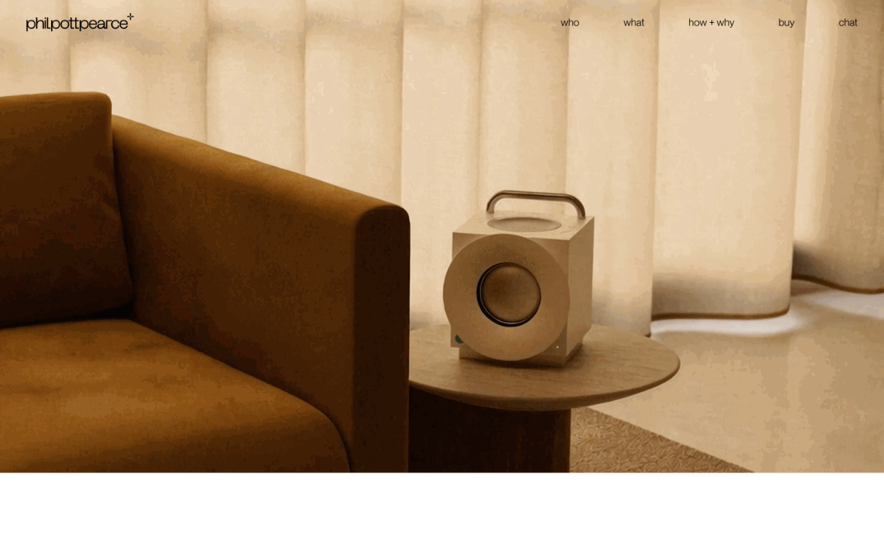

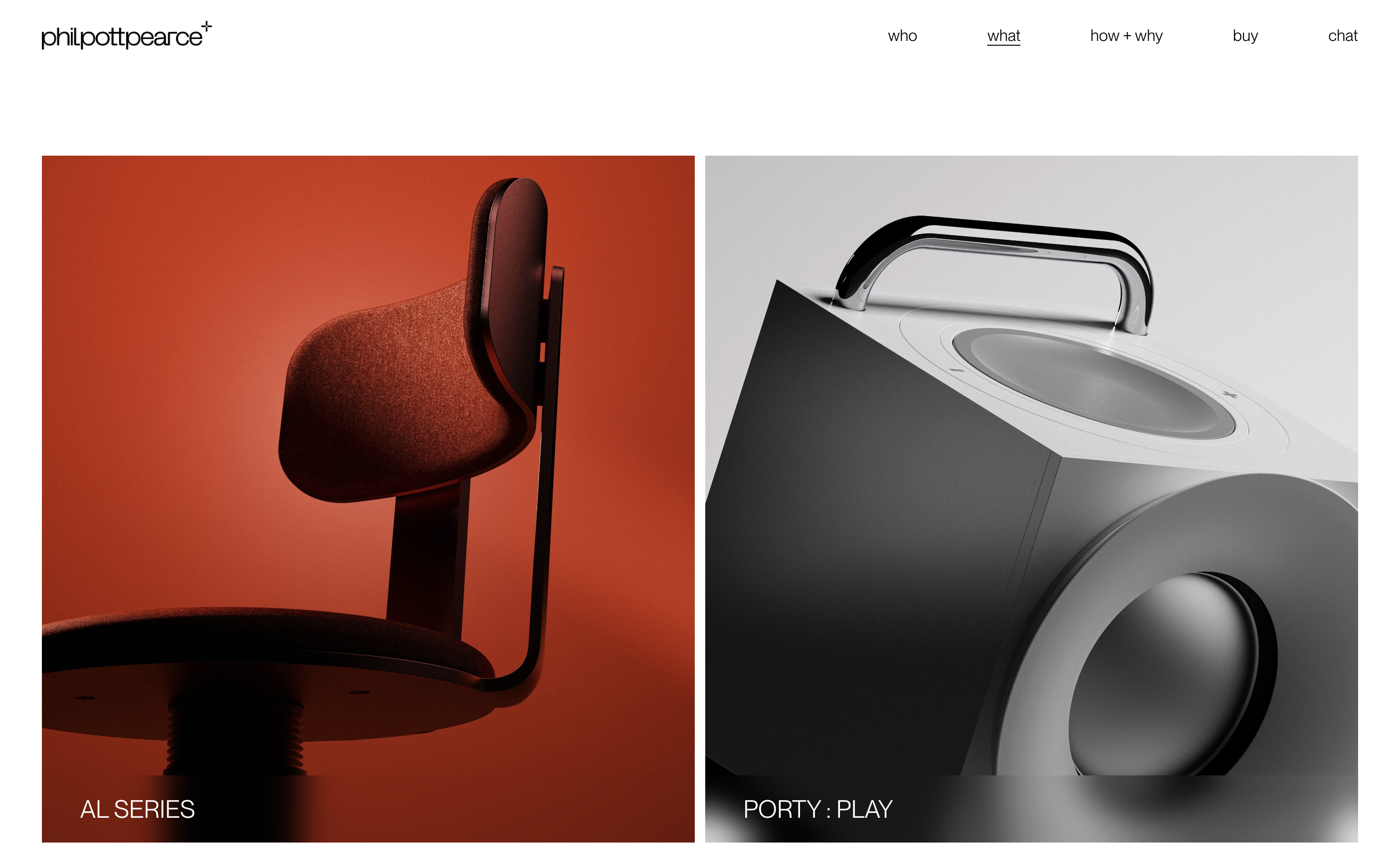
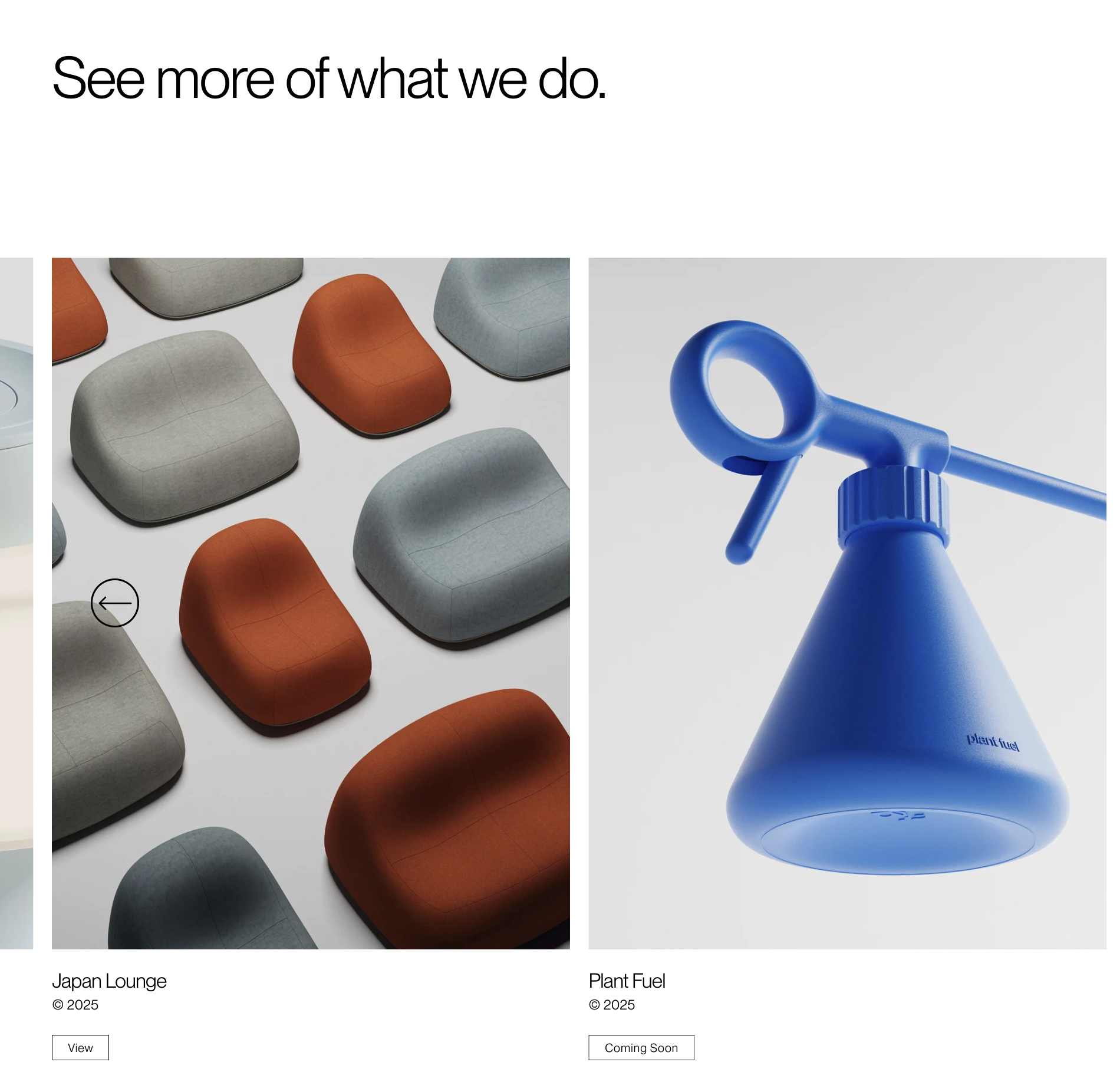
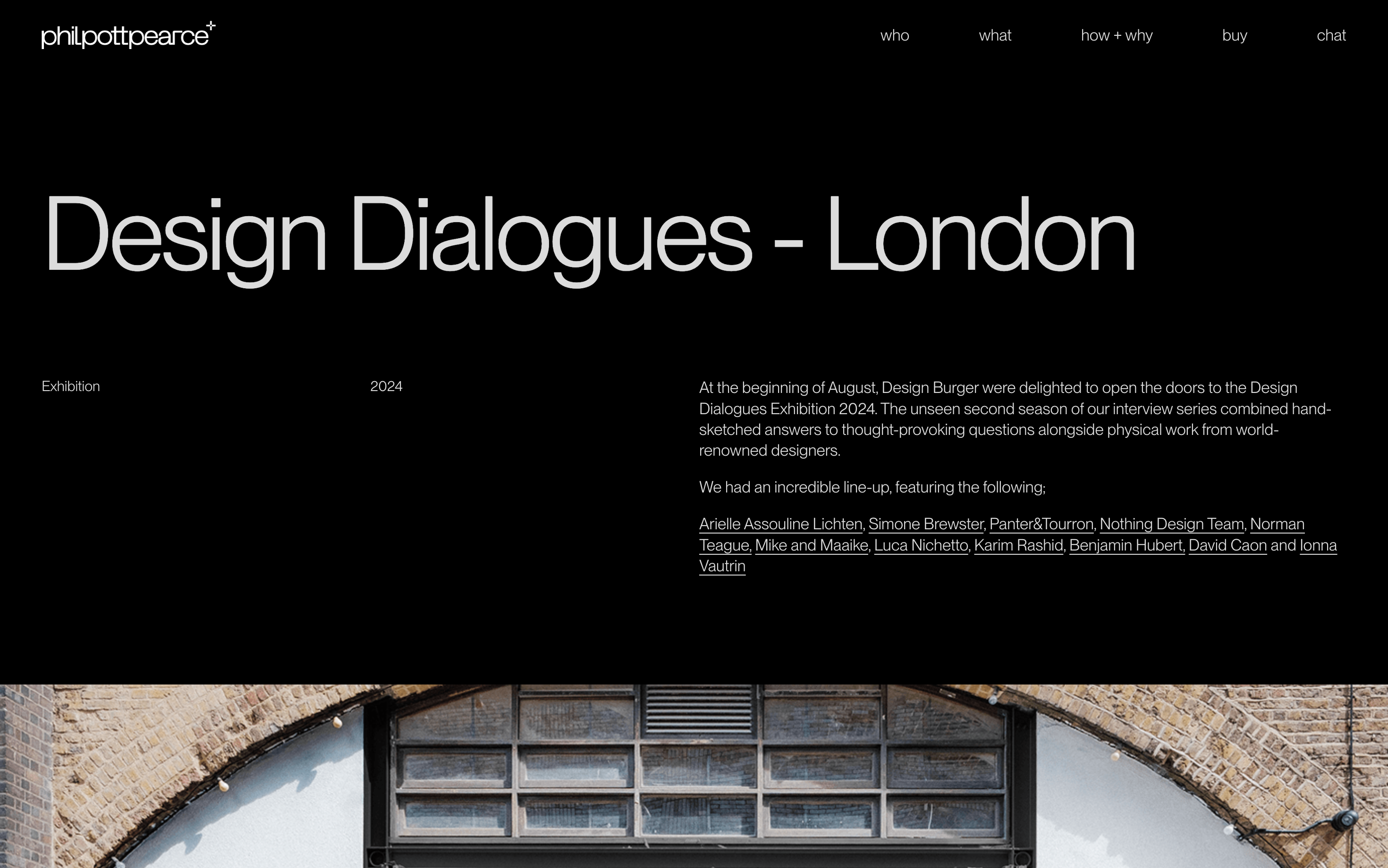
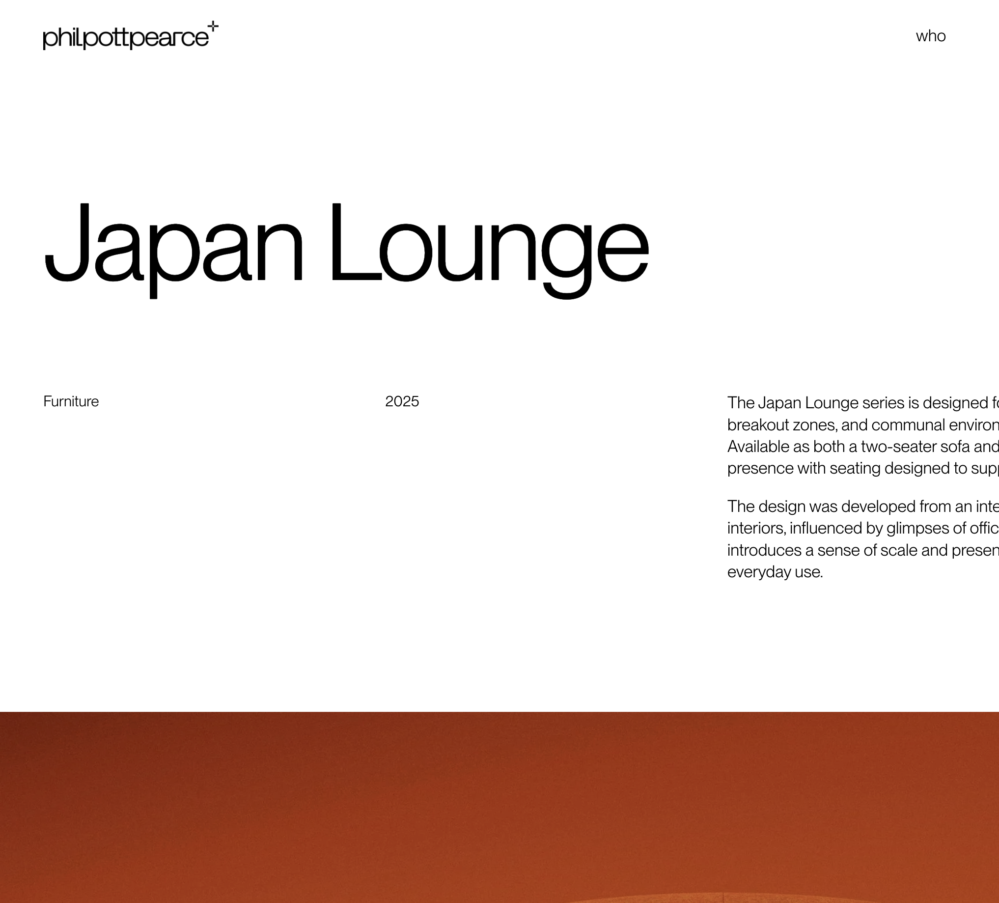
: Project pages built to showcase, not narrate.